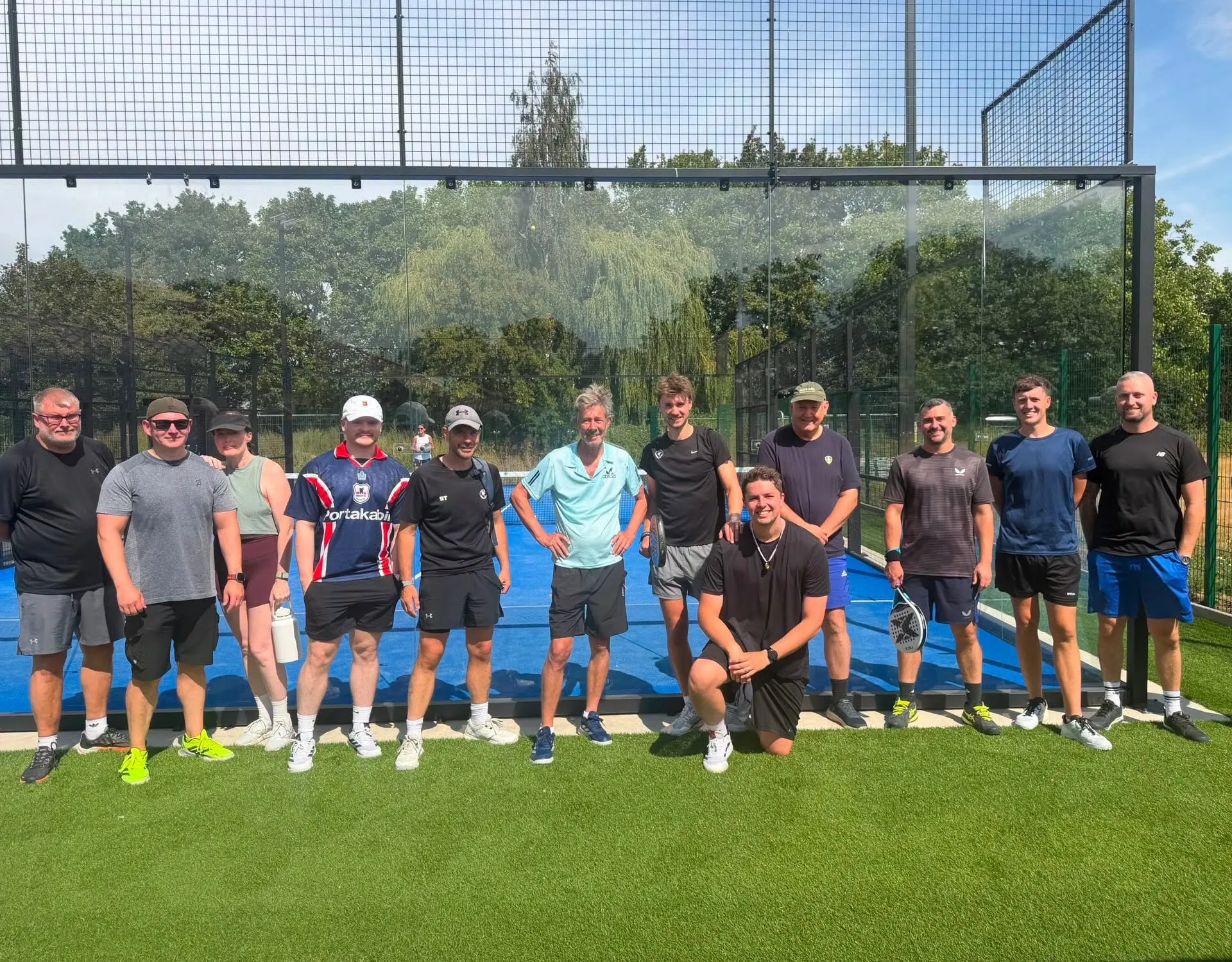
 01Open concept ↗
Community first
The Clubhouse
Warm, welcoming and people-led. This direction sells the friendly local club before it sells the sport.
Best for: Broad local appeal and first-time players
Prototype review · August 2026
Each concept uses the same club information and booking journey. Compare the tone, clarity and feeling—not just the colours.
01Open concept ↗Community first
Warm, welcoming and people-led. This direction sells the friendly local club before it sells the sport.
Best for: Broad local appeal and first-time players
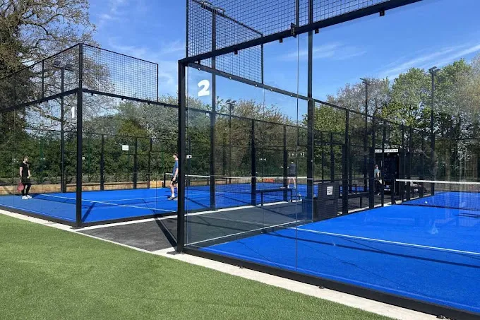 02Open concept ↗
Sport first
Bold, energetic and contemporary. This direction makes the blue courts the hero and keeps action prominent.
Best for: A confident sports brand with visual punch
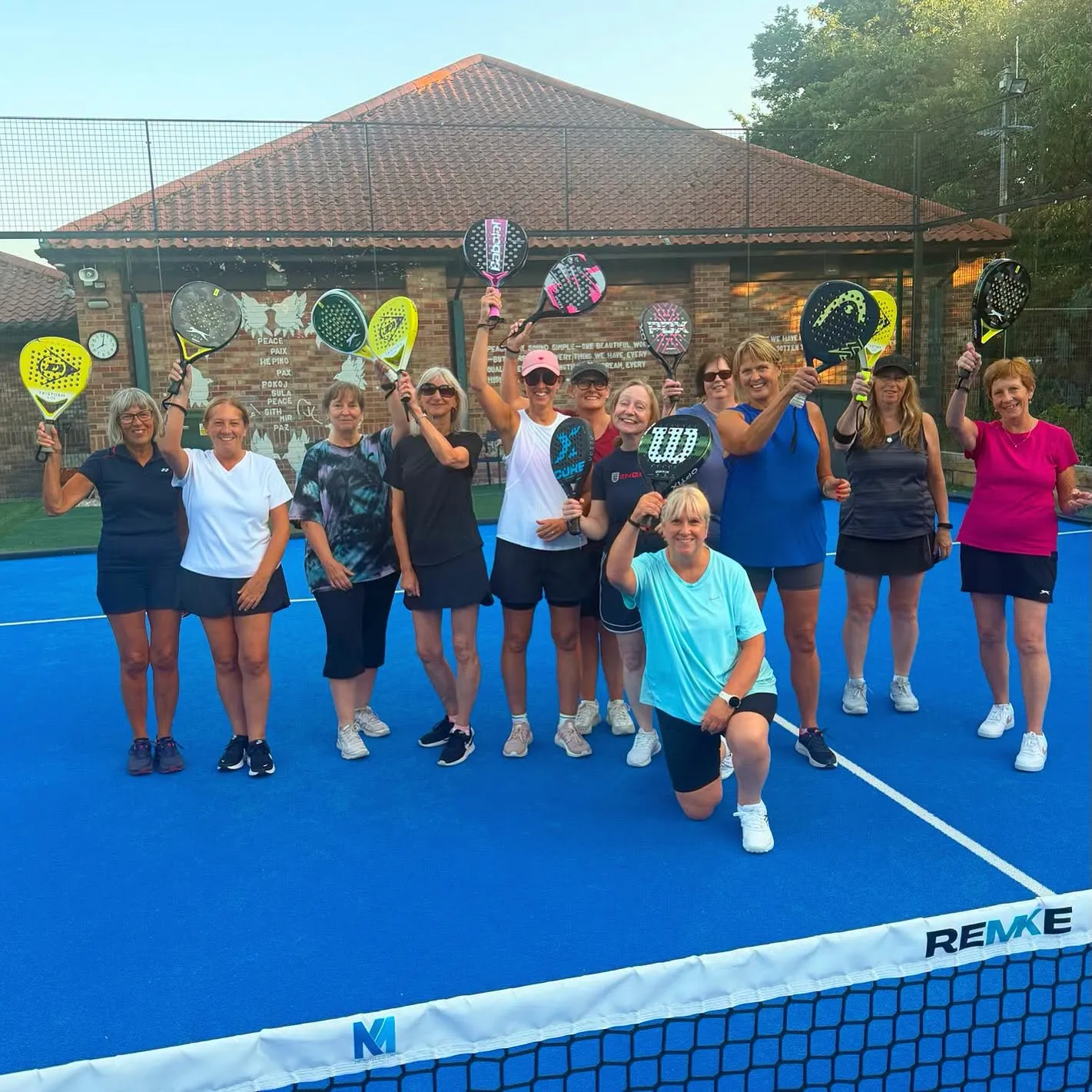 03Open concept ↗
Daytime first
Calm, clear and reassuring. This direction speaks directly to newcomers looking for sociable daytime activity.
Best for: Older visitors and confidence-building
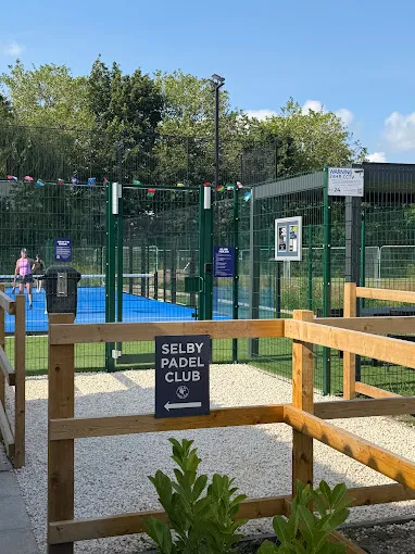 04Open concept ↗
Local first
Bright, useful and unmistakably local. This direction turns the site into a lively digital community noticeboard.
Best for: Club news, activities and approachable local character
 05Open concept ↗
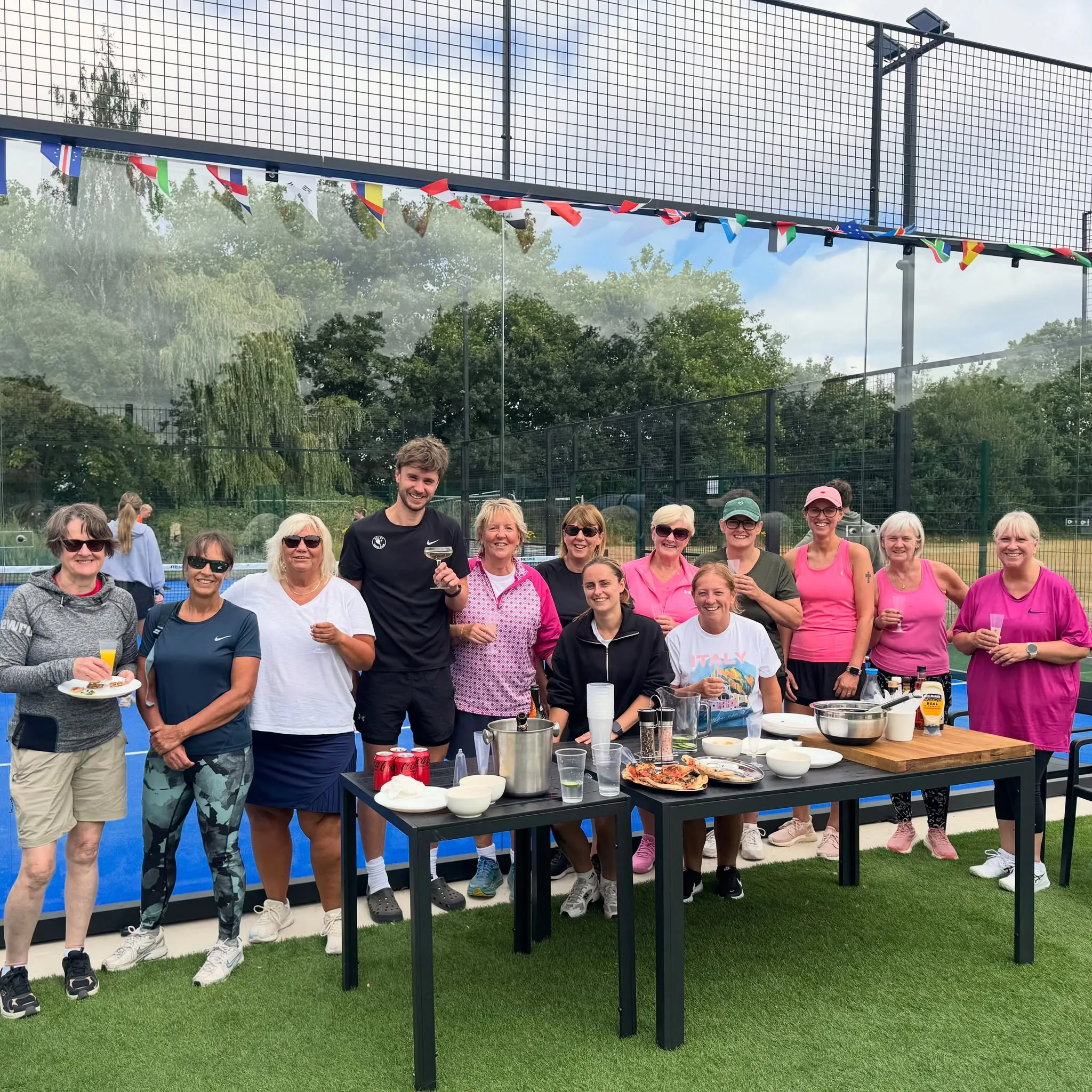
Stories first
Editorial, photographic and people-centred. This direction gives club stories and community life a premium frame.
Best for: A distinctive identity built around people and stories
 06Open concept ↗
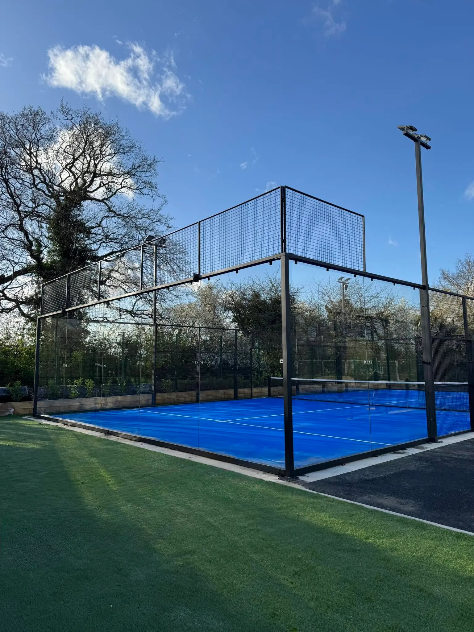
Contemporary first
Polished, spacious and high-impact. This direction pairs a dark photographic hero with bright booking actions and rounded content panels.
Best for: A modern venue feel with a clear commercial journey